
By now, you’ve probably heard the news: on April 21st (that’s tomorrow people!), Google is going to start laying the smackdown on websites that aren’t mobile-friendly. Back in February, Google announced that there were going to start using mobile-friendliness as a mobile ranking signal. Welp, that day has come my friends.
This algorithm update really should come as no surprise, however, given the rise of mobile searches over the last few years. As Demian Farnworth pointed out in an article earlier this month, Google has been setting users up for this type of update for awhile now. If the “mobile-friendly” label they added to SERPS in November 2014 wasn’t a clear indicator of what was to come, I don’t know what is.

Quite frankly, if you’re an Ecommerce business owner who hasn’t made it a point to optimize your website for mobile traffic, you need really need to check yourself. While overall conversion rates on smartphones and tablets may still be lower than on desktops and laptops, mobile devices have become a primary tool for online research prior to users making a purchase decision. Also, keep in mind that the average person switches between devices around 21 times per hour, which means they could be reading reviews and checking pricing on one device, while making a purchase on another.

What Should You Do to Avoid the Google Mobile Penalty?
If you’ve ignored all of Google’s suggestions, warnings, and official announcements, the time has come to pay the piper. Don’t worry, though – we’ve got you covered. Below are the steps you need to take to ensure that your Ecommerce website avoids the pending mobile apocalypse.
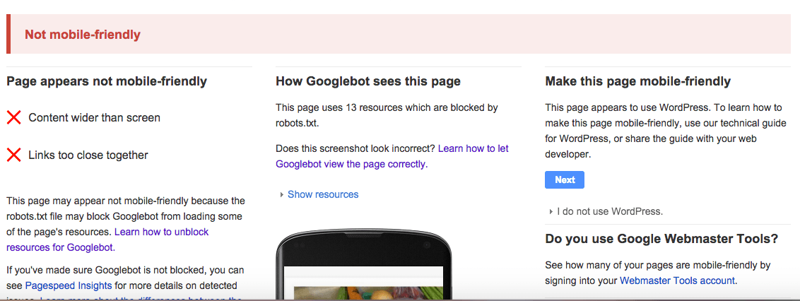
Step 1: Check Whether or Not Google See’s Your Site as ‘Mobile-Friendly’
Since Google’s the one handing out spankings for websites that look like hot garbage on mobile devices, it only makes sense that they give you every opportunity to make things right. They offer a robust Mobile-Friendly Guide that outlines some key areas, including:
- How to customize your software and make your site mobile-friendly whether you use WordPress, Drupal, Joomla, Tumblr, or host of other CMS platforms.
- How to implement mobile SEO best practices.
- Things to know and what to ask when working with a developer on your mobile site.
The guide also features a Mobile-Friendly Test tool that allows you to enter various pages from you site to determine whether or not Google sees them as “mobile-friendly.” If the feedback you get looks like this, you’ve got some work to do:
Step 2: If You Site Isn’t Mobile-Friendly, Get On That!
If Google says your website sucks on mobile devices, you’ll need to fix things as quickly as you can. The longer your site remains non-mobile friendly, the more you’re at risk of being hit with a ranking penalty and losing out on mobile traffic. Here are a few things you can do to get your site on the track to mobile friendliness:
- If you use WordPress, check that you’re using the most updated version and that your theme is updates as well. Sometimes, simply updating WP or your current theme to the latest versions will fix any mobile responsive issues you’ve been having. This is particularly true if you have a relatively older version of a pre-existing WordPress theme. WordPress offers some additional insights into mobile themes, but you should also check out the support site for your installed template for additional guidance.
- This article on Entrepreneur.com outlines some practical ways that you can help make your website mobile-friendly. These include simplifying your site design and content, as well as aiming to ‘future proof’ your site by making sure it looks great on as many devices as possible. It also presents the 3 basic strategies when it comes to mobile site design:
- A dedicated mobile version of your site – You’ll generally see these domains preceded by an “m.” There are some pretty cool tools and platforms like Duda Mobile and Mobilize Today that allow you to create a mobile-specific version of your website.
- An adaptive mobile site – Large companies and enterprises will sometimes go with adaptive mobile designs that detect the type of device a user is using to view their website and delivers a customized web experience. Pretty cool, but not really necessary for your average online business or Ecommerce shop.
- A Responsive mobile site – The majority of mobile-friendly website fall into this category, since it’s the easiest and most efficient way to display a website nicely on multiple devices. Most pre-built themes and site templates today are made to be responsive, so there shouldn’t be any reason for your site to look bad on smartphones and tablets.
- If you’re a bit more tech savvy, you can follow some of the tips present here by Dmitri Lau. Dmitri lays out 10 ways you can help make your site more mobile-friendly, although most of these fixes require at least some knowledge of CSS and coding. If that’s not you, you’ll probably want to consult with an expert before poking around with your site’s style.css sheet.
Step 3: Test Your Site Again
After you’ve gone through the steps of making your website mobile-friendly, you’ll need to continue to test out your pages to make sure that what you see is what Google sees. In addition to using Google’s mobile-friendly test again, you can also use 3rd party mobile emulator tools like MobileTest.me and MobilePhoneEmulator.com to check out how your site looks on various mobile devices.

Both of these emulators are interactive, so you can play around with your website on a bunch of different mobile device and operating systems. If your site’s pages look good across multiple devices on these emulators, it’s a good bet that Google’s crawlers will see your pages as ‘mobile-friendly’ as well.
What do you think about the Google Mobile Penalty set to roll out this week? Is your site prepared, or are you sweating bullets? Let us know in the comments below.
Comments are closed.